Designing an AI product, with AI in the process.
Resolutiion's AI doesn't just summarise contracts: it drafts responses, flags breaches, and escalates disputes on users' behalf.
My role.
Product Lead & Designer · Sept 2024 – present · Leading a team of 3 designers, partnering with engineering, QA, and an AI engineers.
I designed safety-and-agency patterns for an AI that takes real action on contracts → drafting responses, flagging breaches, escalating disputes. I also defined how the team measured AI quality, and shipped a design system that scaled across the product.
Outcome.
Designed safety-and-agency patterns for an AI that takes action on contracts: tiered autonomy, reversibility, source-linked insights
Shipped a design system with engineering: 30% faster delivery, adopted across the product
Onboarded 2 enterprise clients (~600 users); helped close 3 new contracts through pitch-ready demos
Challenge 01
Designing safe agency for AI that takes action
Challenge 02
AI quality measurement
Challenge 03
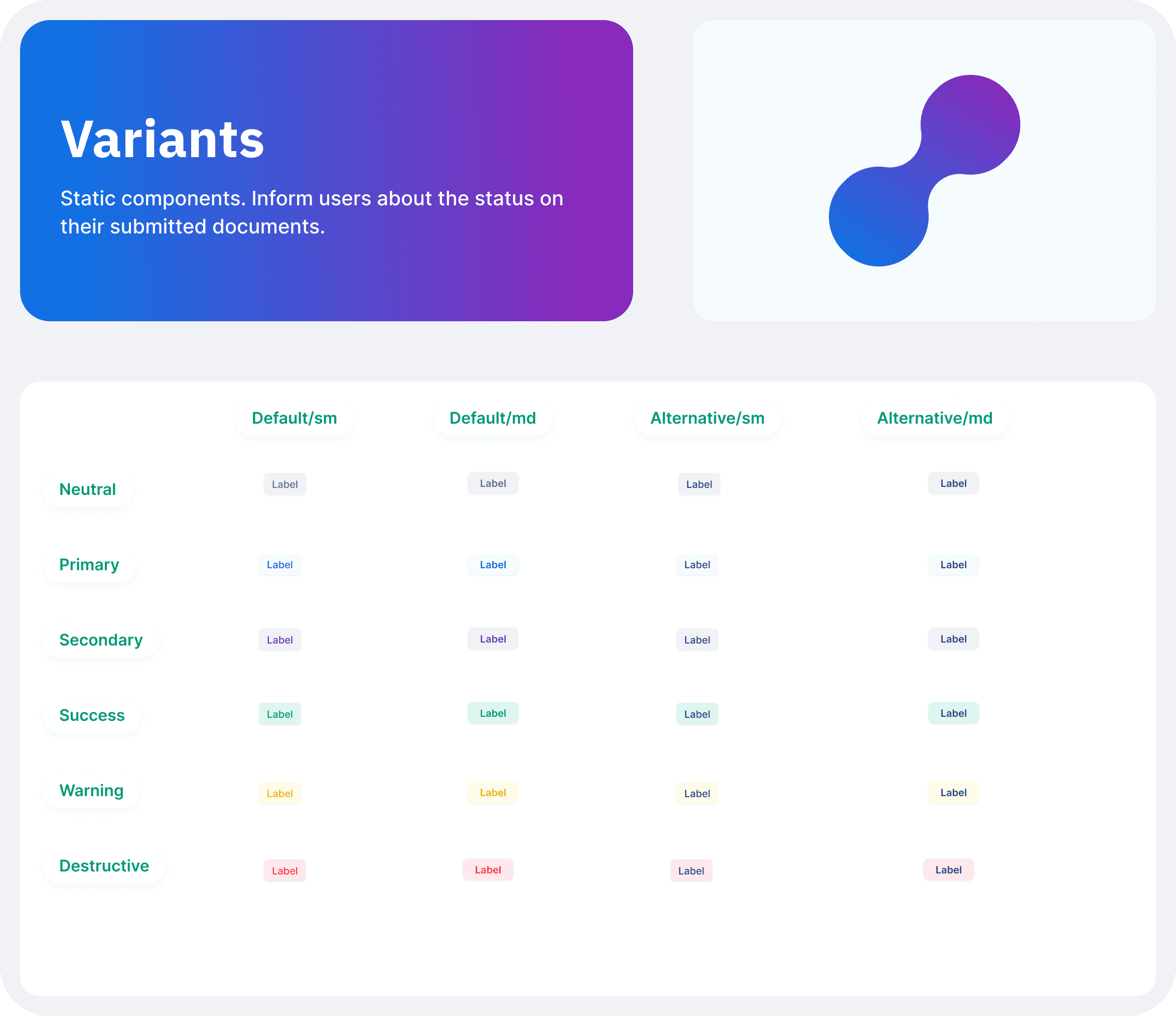
Scaling consistency with Design System
Challenge #1: Designing safe agency for an AI that takes action
Overview
The problem
Business
• AI takes real action on users' contracts: drafting responses, flagging breaches, escalating disputes • To win enterprise trust, the product had to feel useful enough to justify the cost, and safe enough to delegate
User
• Users wanted the AI to do the work, but they also needed to stay in control, especially on actions that touched money, counterparties, or legal standing. •Too much autonomy and trust collapsed the first time the model was wrong; Too many confirmations and the product became a glorified inbox.
Hypothesis
Users will let AI act on their behalf when: • the action is reversible or a draft for review, the reasoning is visible and grounded in their own contract data, the cost of being wrong is visible up front
The outcome
Solution
• A tiered action model -> autonomous for low-stakes, drafts for medium, explicit confirmation for high • Reversibility as a first-class state -> every AI action shows up in one timeline with one-tap undo • Source-linked insights -> every AI-generated insight ties back to its source clause, date, or message • Graceful hand-off to human-shaped paths when AI confidence drops
Impact
• Shipped safety-and-agency patterns that became core to enterprise pitches • Insights panel became the most-clicked area of the dashboard • Override rate stayed flat as autonomy expanded — users trusted the tiers we'd drawn • Became the basis of my conference talk on trust in AI-driven design
My approach
Tiered action model
In order to balance usefulness with control, I designed three tiers of AI autonomy. Low-stakes actions (summarising, tagging, internal notes) happen automatically. Medium-stakes actions (outbound drafts, proposed resolution paths) appear as drafts the user reviews before sending. High-stakes actions (formal escalations, legal notices) require explicit confirmation with a "what changes if I do this" preview.
Thanks to this, users could lean on the AI for volume work while keeping a hand on anything that touched money, counterparties, or legal standing.
Reversibility as a first-class state
In order to make AI action feel safe rather than alarming, I designed a single timeline showing every AI-taken action with one-tap undo where reversible, and a clear "this can't be undone" marker where it can't.
Thanks to this, users could let the AI move quickly without fear → every action had an obvious exit.
Insights tied to source
In order to make AI-generated insights trustworthy, I designed every insight on the dashboard to link back to its source clause, date, or message. No insight without a receipt.
Thanks to this, the insights panel became the most-clicked area of the dashboard → users learned they could trust what they saw because they could check it in one click.
Graceful hand-off
In order to prevent the product from silently degrading when the AI was wrong, I designed flows that route to human-shaped paths (checklists, templates, or "talk to support") when model confidence dropped or users marked an answer unhelpful.
Thanks to this, low-confidence moments became transparent rather than hidden, which is what enterprise procurement actually buys.
Red-teaming with AI
In order to find where the safety/agency line was drawn wrong, I used Claude as a red-teamer against my own flows — asking it to roleplay both a user who would over-trust the AI and a user who would refuse to trust it at all. I used Cursor to spike a working prototype of the tiered action model the same week as the brief.
Thanks to this, the loop tightened from sprints to days: hypothesis → prototype → red-team → adjust.

Here's how the tiered model maps
actions to user interaction:
Trade-offs I made
Sales
Sales wanted a "do everything for me" demo button. I pushed back and shipped a "draft everything for me, send what you approve" pattern instead. We lost a small amount of demo wow-factor and gained the thing enterprise procurement actually buys: predictability.
AI's confidence
I also considered hiding the AI's confidence threshold from users to avoid anchoring them. I rejected this — opaque confidence is the same problem as opaque action. We surfaced it as a plain-language band ("strong match" / "worth checking" / "needs your input").
Outcome
• Shipped safety-and-agency patterns that became core to enterprise pitches
Insights panel became the most-clicked area of the dashboard
Override rate stayed flat as autonomy expanded → users trusted the tiers we'd drawn
Users trusted AI because they could see full trace rather than ambiguous language with no clear thought process.
How AI shaped my process
Used Claude as a red-teamer against my own flows, roleplaying users who would over-trust the AI and users who would refuse to trust it at all. Used Cursor to spike a working prototype of the tiered action model the same week as the brief.
Challenge #2 AI quality measurement
Overview
The problem
Business
• AI ships hundreds of outputs a day (summaries, drafted responses, flagged risks) across users from very different industries. • Internally we knew it was sometimes wrong; we couldn't tell how often, for whom, or whether things were getting better • Without measurement, every conversation about AI quality stayed at the level of instinct
User
• In traditional product, "good" is defined by usability and conversion. • In AI products, "good" has at least three layers, but we weren't owning any of them. We couldn't measure if users actually saw the outputs as fit-for-purpose. • Users from different industries needed different things from the same AI — a useful output for a procurement lead wasn't the same as a useful output for a legal team
The outcome
Solution
• A three-layer quality framework, with design owning the bottom two layers • Datasets of expected inputs and outputs (built with AI's help) to track correctness for the ML team • Three orthogonal product metrics (edit distance, override rate by tier, reasoning-button engagement) to track fitness and trust • Interface changes that captured signal passively, without adding friction to the user
Impact
• Created a shared language for AI quality across design, ML, and product • Surfaced a finding that changed how we briefed the model: users edited generic outputs more than wrong ones -> quality was as much about voice as accuracy • Opened a research direction we wouldn't have found otherwise: trust in AI may depend on user personality types
My collaborative approach
What we assumed - hypothesis
AI quality can't be measured the same way as deterministic software — it needs a different framework
Quality breaks down into three layers: correctness (does the output match ground truth?), fitness (is it useful for this user's task?), and trust (did the user act on it?)
Correctness is an ML problem. Fitness and trust are design problems — and capturing them needs design to own the measurement, not just the output
The definition of 'good'
In order to make AI quality measurable, I had to define it first. I separated three layers: was the output technically correct (the model layer, owned by ML), was it useful for the user's actual task (the design layer), and did the user trust it enough to act on it (the trust layer).
Thanks to this, we stopped arguing about "is the AI good" as a single question and started asking three sharper ones — each of which had a different owner and a different metric.
As a starting point, I worked with the AI team on the correctness layer to build datasets of inputs and expected outputs, which made it traceable on the ML side what the model was getting wrong and where it needed to change.

Here's the framework I used to separate
AI quality concerns across the team:
Choosing the right metrics
In order to measure fitness and trust without ground-truth correctness, I selected three orthogonal product metrics. The trade-off I accepted up front: we still couldn't get pure correctness, but we could get much closer than instinct.
• Edit distance on AI drafts. How much did users change a draft before sending? Low edits = the AI was useful as-is. High edits = useful as a starting point. Rejected outright = unhelpful. A passive metric — no extra UI needed.
• Override rate by tier. How often did users override the AI's suggestion at each stake tier (low / medium / high, tied to the action model from Challenge 03)? Tracked trust calibration directly, and helped us narrow down which tier was breaking trust most.
• Reasoning-button engagement. Where users opened the "Show reasoning" panel — signal that the output wasn't self-evident and users wanted to verify before acting.
Thanks to this, we had three different angles on the same question, which made it harder for any single metric to mislead us.
Designing the interface to measure
In order to capture signal without adding user friction, I designed the measurement directly into the existing flows.
• A "Show reasoning" button on every AI output, which both gave users an out-of-the-box trust mechanism and let us track which tiers and which action types most often triggered doubt.
• Tone tracking: instrumenting where users were getting frustrated, so we could distinguish "wrong output" from "right output, wrong moment."
• Edit-mode capture: when users edited an AI draft, we tracked not just how often but what kind of edits they made: word-level changes, structural rewrites, or full factual overrides. Each meant a different kind of failure.
Thanks to this, signal got captured passively as part of the normal user flow: no surveys, no thumbs-up/down dependency, no behaviour change required.
What we learned
• The most-edited AI outputs weren't the wrong ones — they were the generic ones.
• Users edited drafts that were technically correct but didn't sound like their voice. Quality, for our users, was as much about voice match as factual accuracy. This changed how we briefed the model and shifted the team's mental model of what "good" meant.
• A third finding opened a research direction we're still pulling on: trust in AI appears to depend on personality types more than on output correctness. Some users wanted to verify everything regardless of how confident the model was. Others trusted the AI past the point we'd designed for and was happy to delegate. Pure quality metrics wouldn't catch this — it suggests the next layer of the framework needs to model the user, not just the output.
Outcome
Created a shared language for AI quality across design, ML, and product — the three-layer framework became how the team talked about quality, not just measured it
Surfaced a finding that changed how we briefed the model: users edited generic AI outputs more than wrong ones — quality was as much about voice match as factual accuracy
The "Show reasoning" pattern became one of the most-clicked elements on AI outputs, doubling as a trust mechanism for users and a measurement instrument for the team
Opened a research direction we wouldn't have found otherwise: trust in AI may depend on user personality types more than on output correctness — the next layer of the framework needs to model the user, not just the output
How AI shaped my process
Used Claude to:
• to roleplay edge-case users (a sceptical legal counsel, a high-velocity sales lead, a procurement officer who wanted everything in writing, so I could see where my proposed metrics would and wouldn't capture meaningful signal.
Used Lovable to:
• spike rough versions of the "Show reasoning" interaction before formalising in Figma, which let engineering see what we were measuring and why before instrumentation work began.
Challenge #3: Scaling consistency with Design System
Before

After
Overview
The problem
Business
• Rapid product growth had left the design language fragmented: duplicated components, inconsistent patterns, a slow handover process between design and engineering • Each new feature reopened decisions that had already been made, costing days of design and engineering time per cycle • A design system wasn't a nice-to-have, it was the bottleneck slowing down everything else the team was trying to ship
User
• Customers experienced a fragmented product: inconsistent UI elements, unpredictable navigation, and reduced accessibility • Inconsistency wasn't just an aesthetic problem, it eroded trust in an AI product
Hypothesis
• A design system would only stick if engineering owned it as much as design did: a Figma library that doesn't ship as code is decoration, not infrastructure • Adoption couldn't be achieved through launch, but in a real-life product
The outcome
Solution
• A design system co-built with engineering: Figma library + Storybook, mirrored 1:1 • Shared naming conventions agreed in cross-functional workshops, becoming the source of truth for design and dev handoffs • Documentation that explained why, not just what, usage rules, accessibility notes, decision context • Gradual rollout via a pilot project, with adoption metrics tracked before scaling system-wide
Impact
• 50% reduction in development time per feature, measured across release cycles before and after rollout • Reduced design-to-engineering handoff friction: fewer clarification cycles, faster builds • Underpinned the safety-and-agency work in Challenge 01: the tiered action model couldn't have shipped consistently without the system in place • Adopted across the 3 products within 4 months of pilot launch • Every new feature or iteration addressed changes made to a component
My collaborative approach
Audit
In order to uncover the scope of inconsistencies, I conducted a design audit. I reviewed existing screens against Nielsen's 10 heuristics, tested responsiveness across breakpoints, and mapped duplicated components across surfaces.
Thanks to this, I had a clear picture of where the system was breaking (duplicated buttons, misaligned spacing scales, inconsistent state patterns) and built a prioritised action plan rather than trying to fix everything at once.
Collaboration with CTO
In order to align design and engineering on the same foundation, I ran three weekly workshops with the CTO and engineering leads. We defined reusable components, agreed naming conventions, and decided which existing patterns to preserve and which to retire.
Thanks to this, both teams spoke the same language at handoff. Components stopped being negotiated each time they were used, the conversations moved from "what's a button" to "which button for this context."
Building the system
In order to make the system genuinely usable, I documented the why alongside the what. I built an accessible Figma library, mirrored components in Storybook with engineering, and wrote usage rules that explained when not to use each pattern as well as when to use it.
Thanks to this, new team members could onboard quickly, and the system stayed sustainable instead of becoming another thing to ignore.
Iterative rollout
In order to earn adoption rather than mandate it, I introduced the system gradually. I piloted on a single live project, gathered feedback from designers and engineers using it in production, and iterated before scaling system-wide.
Thanks to this, stakeholders could see real value early on — which built trust in the system itself and accelerated adoption across the rest of the product.
Trade-offs I made
Speed vs depth
I considered building the system out fully before rolling it out — covering every component, every state, every edge case. I rejected this. A "complete" system shipped six months late would have arrived after the team had already built workarounds, and adoption would have been near-impossible. We shipped the 60% that covered most use cases first, and iterated from there.
Component coverage vs naming
Engineering wanted to start with components — get the most-used buttons and inputs into Storybook quickly. I pushed back and prioritised naming conventions in the first three weeks. We built fewer components in that time, but every component we did build slotted into a shared vocabulary. The trade-off paid off when the next ten components went in twice as fast as the first ten.
How AI shaped my process
Used Claude:
• to draft component documentation, usage guidelines, and migration notes, turning what's usually a sprint of writing into a few hours of editing.
• as a sparring partner on naming: pasted the proposed component names and asked it to argue against each one, which surfaced ambiguities before they hit the team.
What we learned
Naming was the leverage point. Components followed once the vocabulary was shared — but starting with components and trying to retrofit names afterwards would have failed. The order matters.
Documentation explaining why was the part teams actually used. Component specs were referenced rarely; the "when not to use this" notes were referenced constantly.
The pilot-first rollout strategy was load-bearing. Adoption built from people seeing real value in their own work, not from a launch announcement.
The above examples have been selected based on confidentiality agreement. If you'd like to see more, please get in touch with me 😊
Currently exploring senior product design and product lead roles where I can ship AI-driven products and shape product strategy.

